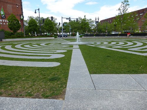
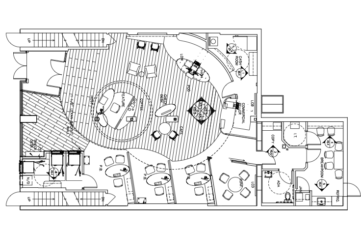
The general rule for architects is to determine where to install walkways that follow traffic paths. We’ve all seen the worn grass paths cutting across and through the intended design of geometric and aesthetically pleasing hardscapes originally created to direct pedestrians from one point to another. As a result, experienced designers take the time to see how people use a particular space before laying the brick, spreading the gravel or pouring the concrete and install the systems based on what the users determine is the most user friendly. This thinking should apply to most design elements, promotional placement and services within your business.
During a recent credit union visit we noticed a brand new motorcycle parked between the customer service counter and the teller lines. Placed there as a promotional prop for low interest loans on motorcycles, the bike theoretically was in a great location. The problem is that the waiting area is positioned in such a way that customers have to zigzag, not only away from the motorcycle, but also away from another beautiful promotional display. This particular credit union was very diligent in establishing stimulating promotions, but not how their customers navigated the space and as a result, essentially deemed the promotions invisible.
There is a science and a lot of psychology involved with properly creating an effective and user-friendly retail and service-oriented space. Successful grocery stores have mastered the art of effective layout and design, which result in more sales and customer retention. “Nothing in the store is by accident. Everything is by design,” said Paco Underhill, founder and C.E.O. of Envirosell, a retail-focused research and consulting firm in New York. One of the things that the Food Marketing Institute and the Point-of-Purchase Advertising Institute have told us is that roughly 60 percent or more of what we buy in the supermarket wasn’t on our list,” Underhill said. “If I stop somebody on their way into a store and have them review for me what their mental list or written list is, and then I look in their basket as they walk out the door, roughly 60 percent of what’s in that basket they didn’t tell me about walking in.” The key, says Underhill is to get the consumer to stick around. This is why grocery stores have pharmacies and banks. The longer a customer is in the store the more they are likely to buy.
“Certainly a retailer tries to direct you through a store in a way that’s more advantageous to generating more sales,” said David Bell, a professor of marketing at the Wharton School of the University of Pennsylvania. “They’re going to be stimulated by promotions and things in the environment.”
However, the promotions and stimulations must be positioned in such a way that the consumer can’t miss them and this is done in combination with strategic design, but also in realizing where and when a customer will most likely engage in a promotion. Grocery store science is long studied and considers every action and thought of the consumer from what hand they push the cart with to what is at eye level versus waist level. (Read More) So when was the last time you took the time to observe your customers in action? How do they move through your space or more importantly, how do they want to move through your space? Where is their focus? Are they occupied trying not to bump into things or noticing the shiny new motorcycle they hadn’t considered buying, but now imagine the wind through their hair because they have been able to feel the leather seat and sparkle in the paint? Do your customers frequently ask the same questions? If so, then perhaps it is time to resolve the issue by making a change and reinventing a system that eliminates the confusion.
Consider the frustration you’ve felt as a customer when you can’t find what you are looking for and have to ask where to find something. It should be your mission to eliminate as much frustration as possible for your consumers while also welcoming them into a user friendly space and inspiring them to interact with your promotional items. After all, you’ve invested the time, energy, money and space into a promotional display so you want to maximize the effects of it and capitalize the results it produces. This, of course, is accomplished by positioning the promotion in a place the customer is most likely to engage with it. Where do customers take pause? Where are they moving at a fast pace and head down? Where are they forced to stop? Remember that the average attention span of the average American is now eight seconds. Figure out where you can capture those eight seconds and position your promotion in that spot.
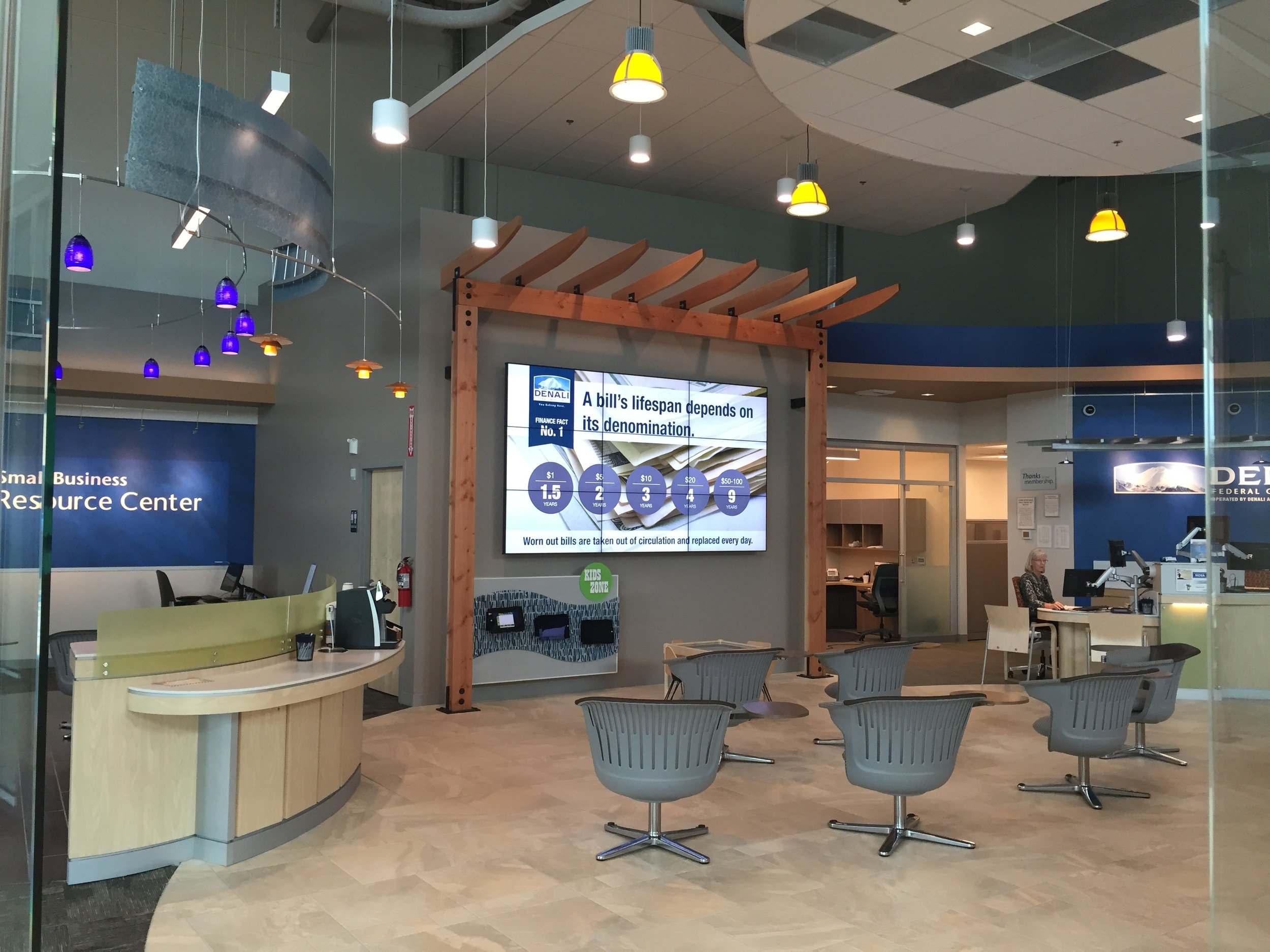
Digital displays are fast becoming a solution for the over active mind and distracting environments. Static displays can become a bit like furniture and instigate an element of apathy while a consumer navigates a space. Digital displays function in the realm of the modern mind and offer enough movement and change that a consumer will likely take notice. Like a fish to a shiny lure, digital displays prompt a consumer to see what it moving on a screen and if the image and content is compelling enough you can get your message across within the six seconds offered.
Element, specializes in creating efficient retail spaces and effective promotional items, but we encourage you to observe your customers. Watch not only how they use your space, but also how they want to use your space. This will help you learn how to better accommodate your customers and get the most from your promotional displays.
Denali Alaskan Federal Credit Union
Sometimes major design changes are needed, but sometimes it is as simple as moving some furniture and directional but as we always say Every Bit Matters.
————————————————————————–
Article written by Brent Beckett for The Element Group.
Edited by Lyndsay Reese.
