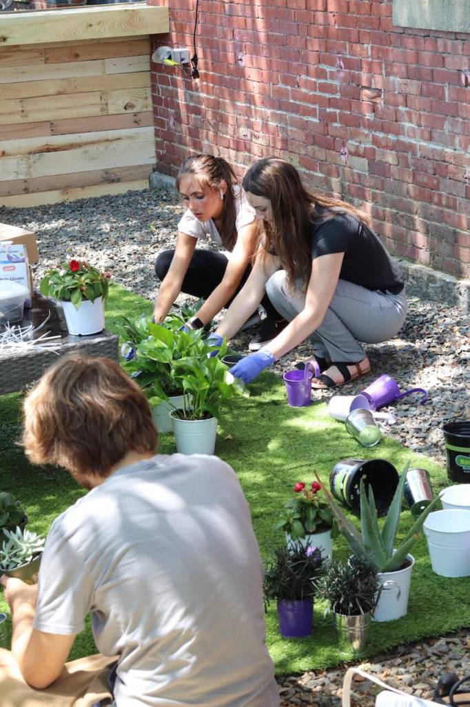
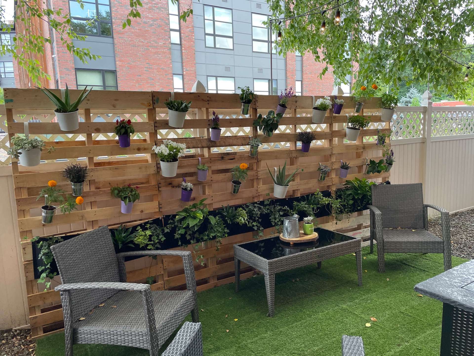
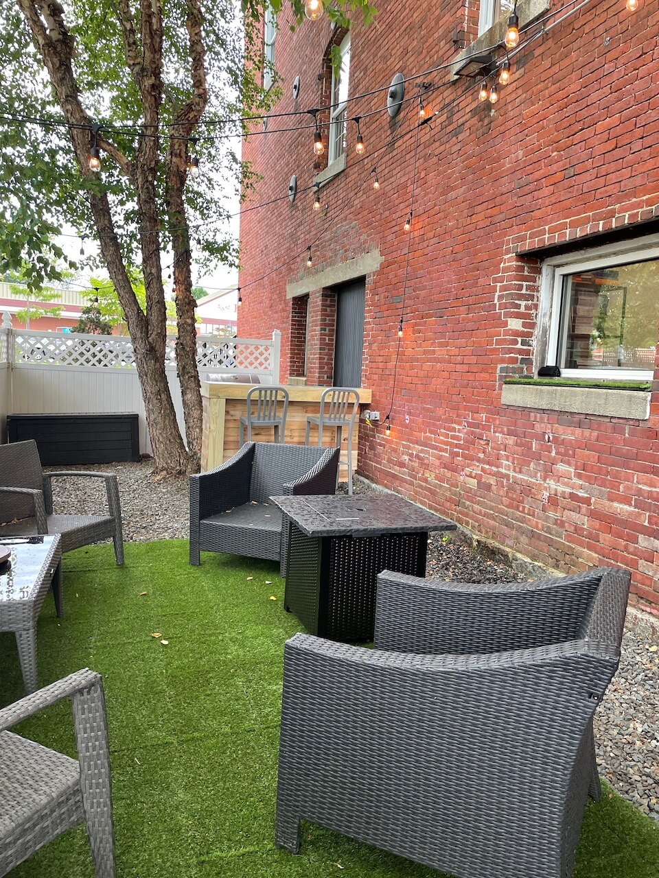
On Friday, July 15th 2022 Shauna Cronin and Brooke Mantegari completed designing and creating Element’s outdoor patio. Below is an interview with the two, detailing their experience of completing this task.
What are your roles at Element?
Shauna: We are both interior design interns.
What will the patio space be used for?
Shauna: It will be used when clients are here, like when the clients from Matanuska Valley came.
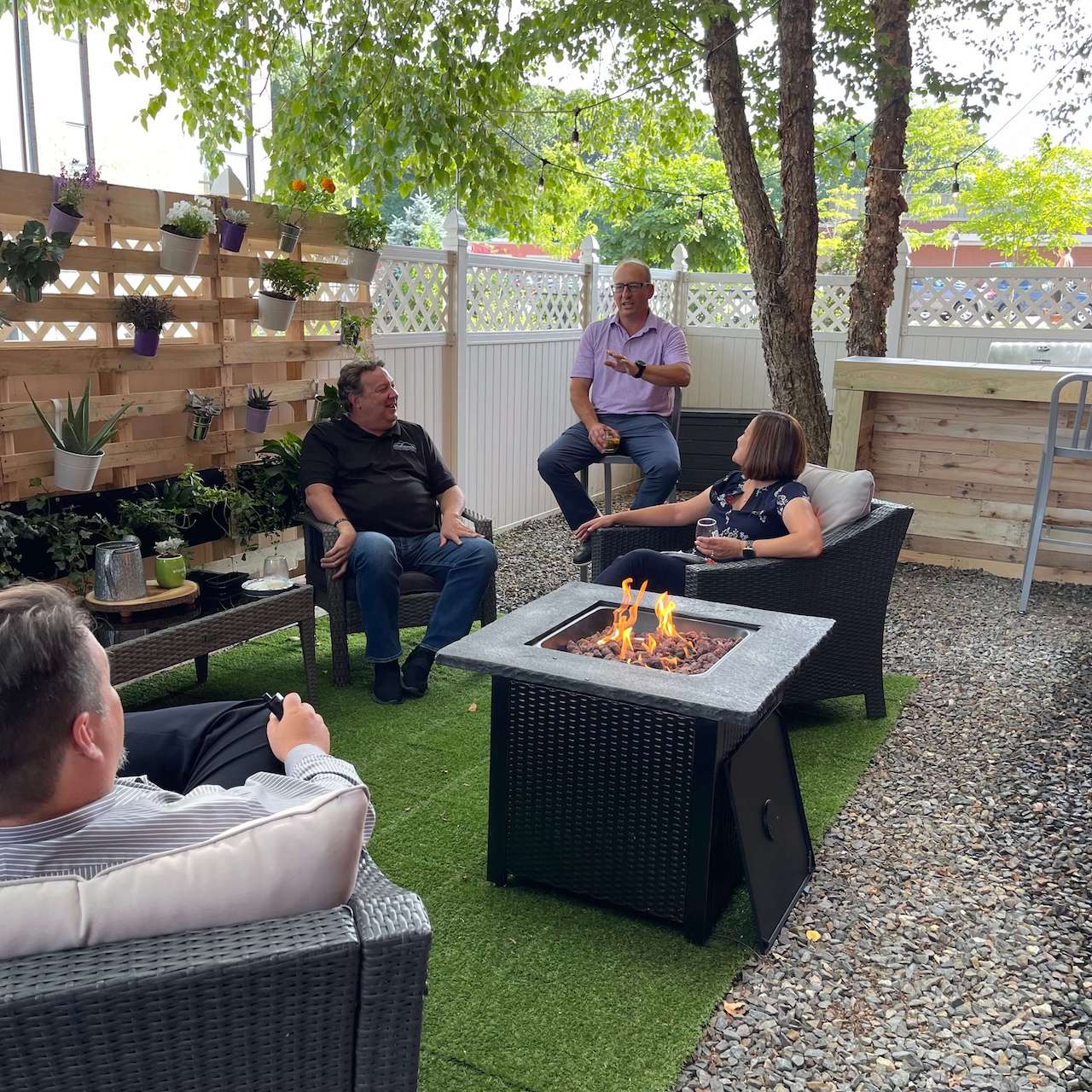
Brooke: The space will be used for gatherings, maybe BBQ’s and happy hours since we have the grill and bar. It will be nice to just bring people outside.
How long did the patio take to complete?
Shauna: It is hard to gauge but I would say 3-4 weeks…it was more the last two weeks we were putting it together physically but the weeks before we were doing a lot of planning and looking for what we were going to use and incorporate.
What sort of features does the patio include?
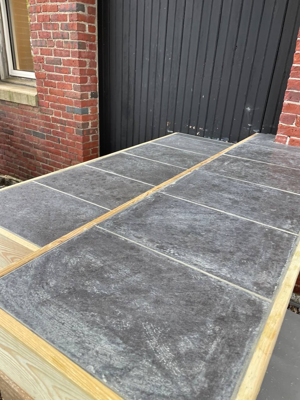
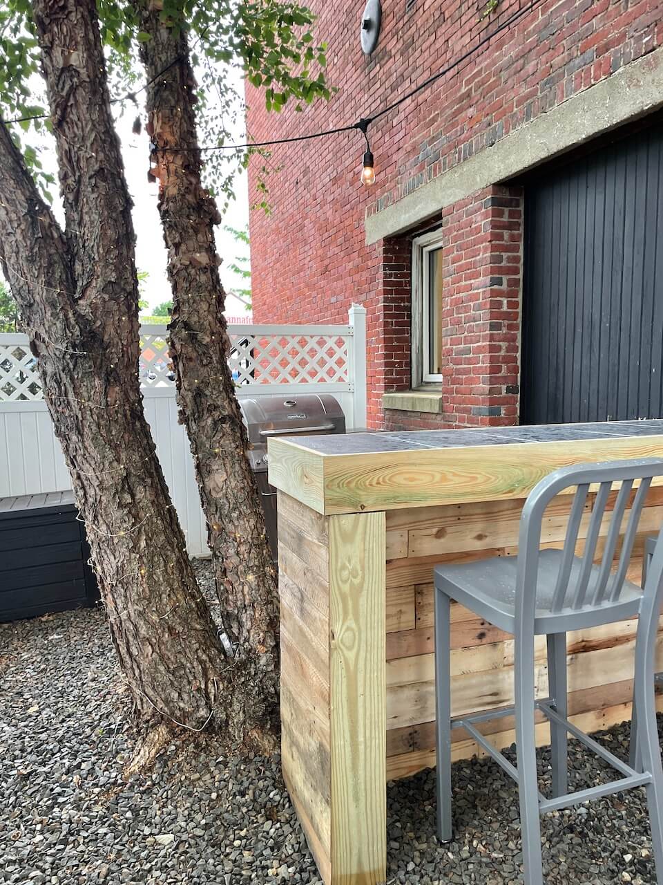
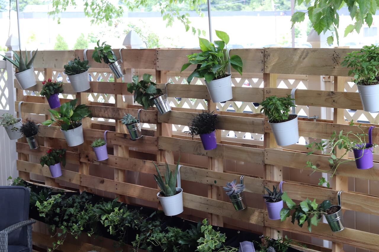
Shauna: The custom-built bar. We drew the plans for it, in CAD, and Down to Earth Construction built it. There is also a greenery wall that we drew the design for.
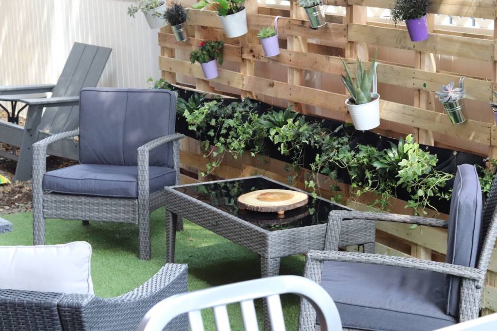
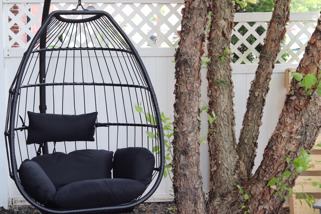
Brooke: There is also lots of seating, a hanging chair, and a firepit.
What did you start with?
Brooke: We started by making a mood board. We also looked at the layout and existing furniture and space. By looking at the existing space, we let the environment designate purpose to different areas. An example would be the two trees outside.
The placement of those trees let us designate the bar to one side, the greenery to the other, and the main seating in the middle.
Shauna: We basically were pulling images and ideas for inspiration to figure out what we wanted to make it feel and look like. Pinterest was helpful too.
Brooke: We took the most inspiration from Element’s brand. Looking at the website and different spaces in the office helped us brainstorm ideas of how we wanted it to look.
What do you like most about the space?
Brooke: I really like the hanging chair because it adds something new to the space. The typical seating is obviously on the ground, but I liked how the hanging chair adds some verticality, as does the green wall. And with a very horizontal space it was important to focus on dimensionality. I think comfort, fun, and innovation are also very important to Element so adding things like the hanging chair, green wall, bar, turf, and firepit really help create a sense of community and warmth which is one of my favorite aspects of team Element.
Shauna: I would say mine is the greenery wall because I think that while giving a bit more privacy, it also provided comfort. People tend to relax around nature, so introducing a variety of plants in a cute way really seems to make people feel comfortable in the space. Additionally, the planters on the wall are also hanging freely, therefore, there is room for change on the wall. If you get bored with the design, it is flexible enough for you to change it just the way you would like to.
How did you go about choosing the materials?
Shauna: We stuck with using a lot of wood, creating the rustic and industrial feel that Element possesses. The bar will probably be stained as well to make it feel more like Element’s style.
Brooke: We based it off the interior décor Element already has. The big “e” in the upstairs conference room was an inspiration and we hope to include something similar in the future. We also liked the lighting and the concrete look against the brick. Both upstairs and downstairs conference rooms also have wood elements, like the table.
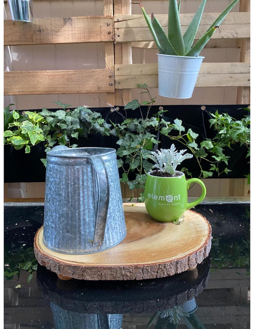
Shauna: We also made sure the materials could be used outdoors so the weather doesn’t ruin them. There are tiles on the bar as well and green turf on the ground. We also included a small “planter” on the coffee table to show the company name, which was actually an old mug which brought in the Element green and shows a little of the brand.
What element are you most excited about?
Brooke: To hangout outside and complete our work in the fresh air and warm weather.
What was the most challenging part of building the patio? How did you overcome this challenge?
Brooke: Getting things custom built, we didn’t personally know the contacts, the cost, or the time frame of custom builds so planning was a bit tricky.
Shauna: Making CAD files, which is basically showing all of the dimensions to the builders to help them understand what we want. We had to be very precise with this.
Brooke: Laura helped us a lot, I did a lot of the building the CAD after Laura explained the detail that needs to go into it…and then Laura did a lot of the legwork with the communications side too.
What part was the most fun?
Shauna: Shopping! We went to HomeSense and TJ Maxx!
What were your design inspirations?
Brooke: We weren’t really told to do anything specific. William and Nate gave us a couple ideas, like the bar.
Shauna: William and Nate also wanted a hammock but there wasn’t enough space, so we chose a hanging chair. Other than that, we didn’t really have any guidelines to follow.
Brooke: A big thing we went with for the design was looking at the elements of Element and so we did a purple area, a green area and an orange area- for amplifi. So, the bar area is supposed to be the amplifi space because it
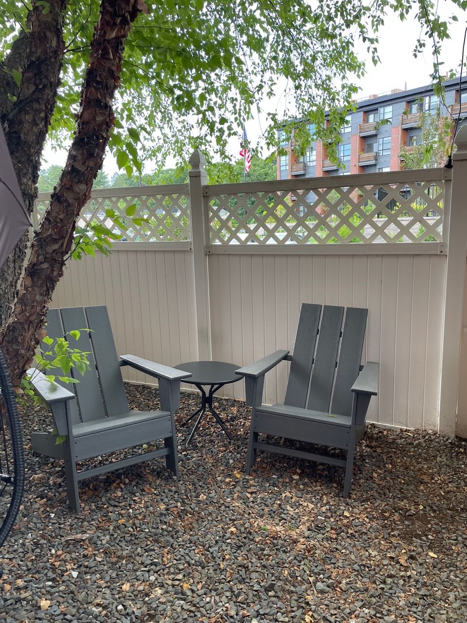
Shauna: To add to that, the purple is the middle area with the chairs, but the colors are definitely throughout the whole space.
Brooke: The color scheme definitely helped designate ideas.
