Creativity, Adjustability, and Collaboration. With the constantly evolving trends, these three themes create the foundation for a great workspace. Laura and Caleigh are interior designers here at The Element Group and they sat down and shared some information about the design process.
What steps do you take when designing?
Caleigh:
Step 1: Meet the client – This gives a sense of the personality the client that the designs are for, as well as the brand that the company stands for. Always go into the first client meeting with an understanding of who they are, through research. Learn about what could be done for them and as well as things such as past projects and missions.
Step 2: See the space – Either through photos or an onsite visit to see the space is essential. This is the time to define and understand the scope of the project, what the limitations and concerns may be, begin to explore all the available opportunities, and if needed, record measurements.
Step 3: Research + Idea gathering – Based on the client meeting and site visit, the information gathered is used to establish ideas for the space and to find photos of similar or drastically different spaces for inspiration.
Step 4: Schematic Design – This is when the formal design process starts. Using all the information gathered, one can start to scribble rough ideas and gather product images that support the ideas that are generated. When defining spaces, it is vital to start thinking about the space three dimensionally through things such as elevations and sketches. The design process continues with decisions about space size and functionality. Followed by materials, furniture, and finishes needed to ensure the look, feel and functionality the client desires. Once things are finalized, the completed design development and the construction documents are assembled in order to finally build the space
How do you determine the best color scheme for the space?
Laura:
It starts with an interview to determine the desired look, feel, and approach. Their design team gets involved and talks over their branding guidelines/standards in the form of a manual. This can contain the color palette, logo and how it should be used, and specific paint colors.
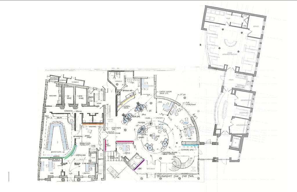
Desert Financial Credit Union Layout
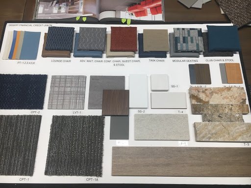
Usually there is an element from another branch or their logo that they want to carry over. It could could be something like walnut paneling, a specific color blue or a special carpet. Sometimes, if there is a large logo wall with video displays, one of the colors featured could be used to create a stronger brand. There is usually a neutral color prevalent through the space, and then accent colors (along with environmental graphics) are used to focus the customer’s eye on certain areas. Often the carpet is selected first and it plays a huge factor in determining the rest of the details that will be added such as the laminates, tiling and countertops. Finding a carpet that enhances and blends with some of the accent colors can provide a base for everything else.
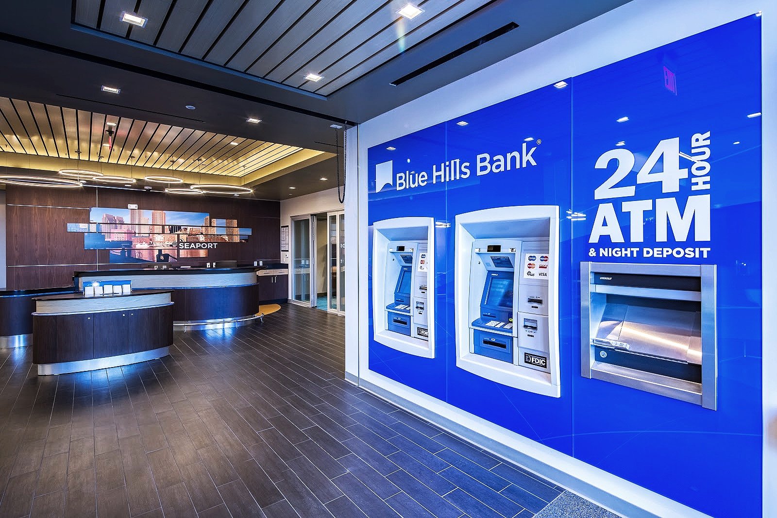
Blue Hills Bank: Seaport
Caleigh:
Utilizing a company’s brand as the start off point and finding something else we would like to highlight is key. Using those logo style colors and brand guidelines as a key, the next step is to gather materials that complement and harmonize with the brand/logo, and find materials that will make the brand really POP. If a company has a bold logo color and style and values fun and bright graphics, the goal is to bring those colors subtly into the space so that the overall impression is not overwhelming. Balance is also key with color schemes. If there is a certain orange found in the graphics or on one side of the space, one should be bringing in that warm tone on the other side whether it is through paint, fabric color, or wood tone.
What would be 3 or 4 crucial things to keep in mind when designing a modern workspace?
Laura:
- Simplicity. An uncluttered and sophisticated approach that emphasizes fine lines and a sleek, seamless look. A well planned space will allow extensive collaboration in addition to focused individual work. One should have more than one option in the space, this includes conference rooms with increased privacy so not to disturb the other people working, areas dedicated to individual work, and areas for the team to meet and alternatively hang out. There also should be private spaces that allow individuals to find an increased focus. Finally, there should be ample space given to an individual so they can perform their job effectively and efficiently.
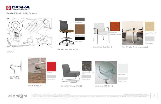
Popular Community Bank Lobby Furniture: Dadeland Branch I
- Furniture and Finishes. Furniture must be comfortable and ergonomic and both must work together to capture the feel and design of the space, be it traditional, modern, or transitional. Comfortable ergonomic furniture is something that has been stressed over and over again as it is one of the most important elements. It is crucial to have options in order to easily adapt to different body types and preferences and be welcoming and supportive of the person in it. It should be of high quality and welcoming.
- Signage and Wayfinding. For a client, properly designed signage helps the customer identify key areas and clearly directs them around the space.
Newburyport Bank: Newburyport, Massachusetts
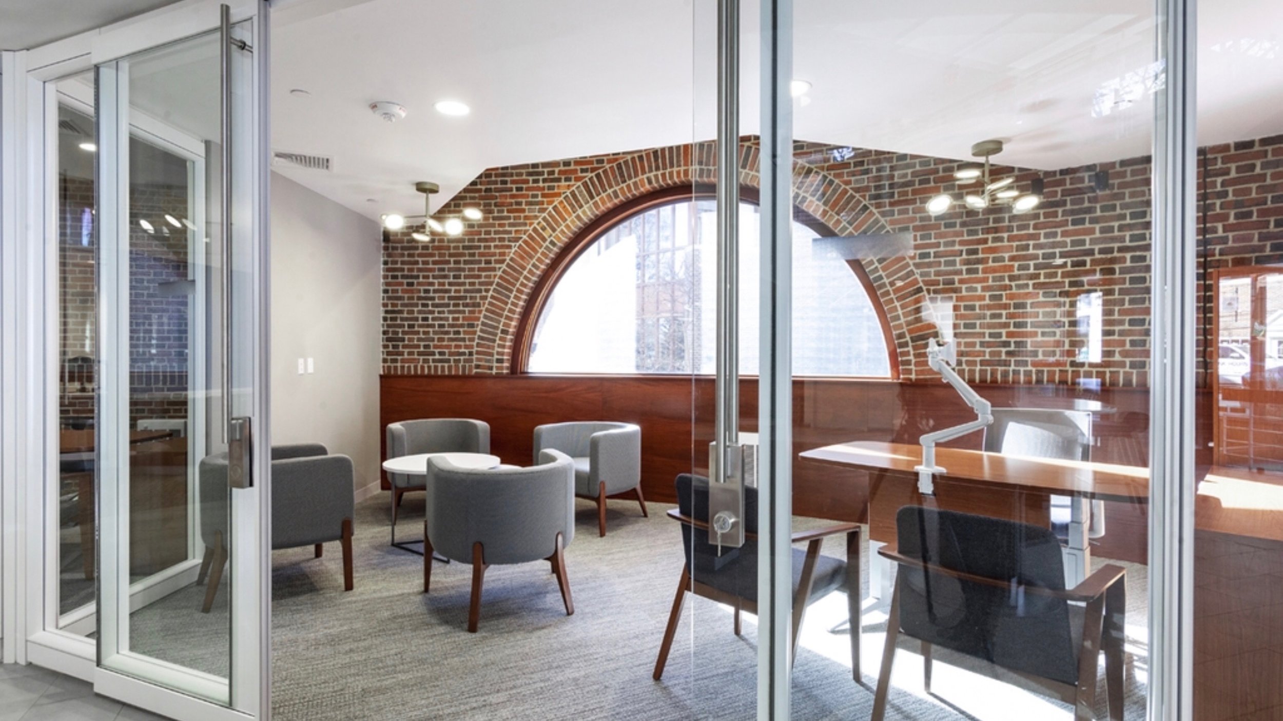
- Glass. Previously, workspace design only used this delicate, yet versatile media for small window panes. Now, designers are embracing this material and are seeking to incorporate it as much as possible. Having an abundance of glass in the design improves the sleek and modern aspect of the space and boosts the moral of the people working there. Glass can be treated in a way that it can regulate heat and still provide ample light, thus reducing electrical costs.
- To extend on that, Lighting is really important, whether it is for employees, overall illumination, or to highlight features, it should be appropriate for the task at hand.
Part II Coming Soon!
_________________________________________________________
Interview written and conducted by Bryn Baldasaro for The Element Group.
Edited by Bryn Baldasaro and Dawn Rabinowitz.
Special thanks to Laura Mynahan and Caleigh Pollard.
