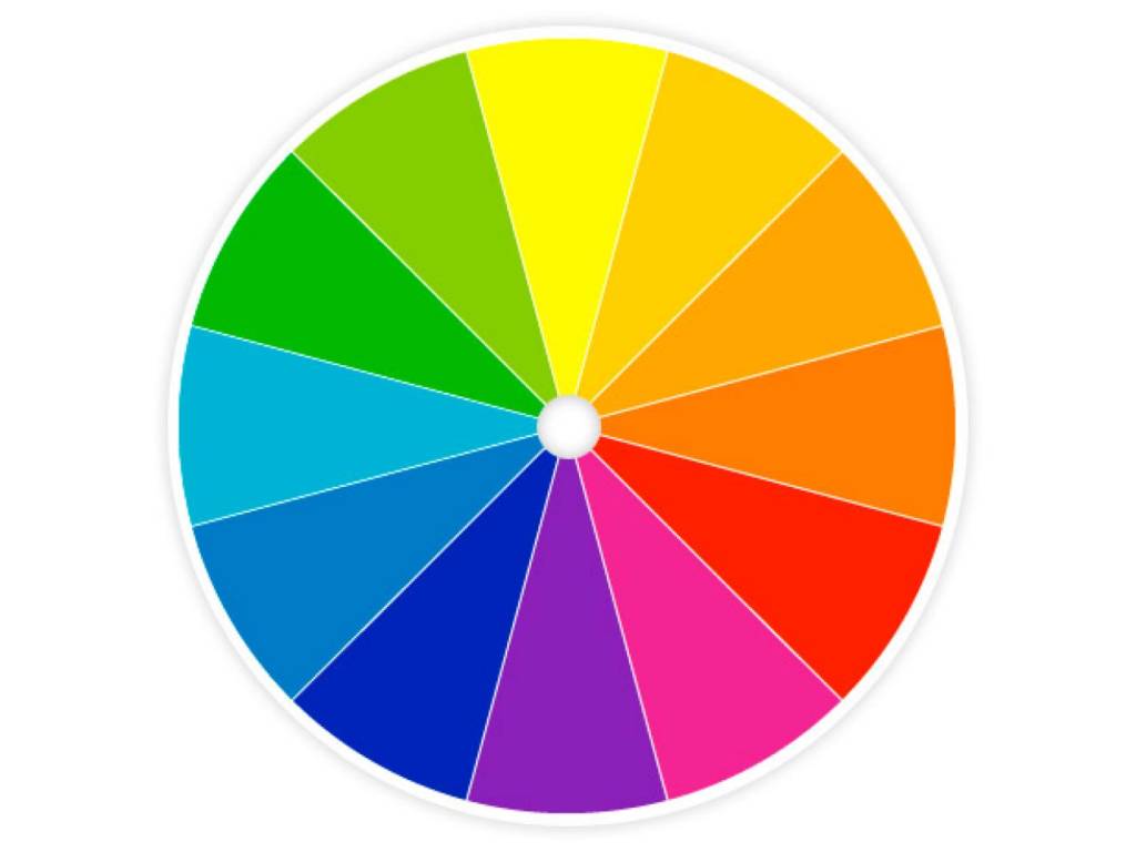
We are going to talk about something that you may have learned about in elementary school, or maybe even high school. It is called the color wheel!
This may look simple or complex, but it was actually confusing to me when I was learning about it in my high school art class. Starting with the basics, you can really learn how to make your space look more cohesive, and make your brand colors really POP!
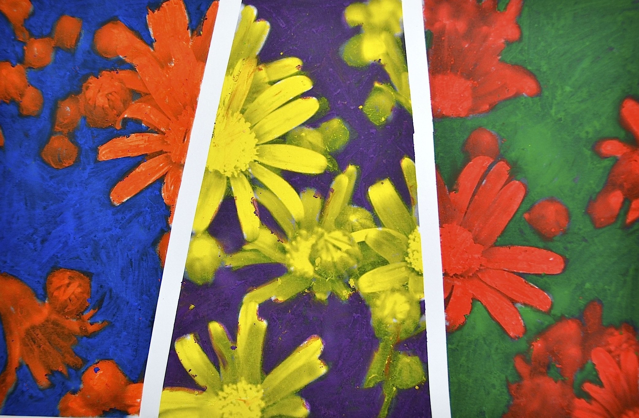
Complementary colors are located opposite to one another on the color wheel. As the term says, they complement one another. These combinations, which were derived from the red-yellow-blue model, are red and green, purple and yellow, and blue and orange. Using these combinations can make a space feel vibrant and play up the others intensity.
Using a high contrast with both complementary colors can produce a bold, and vibrant affect to a space in order to grab maximum attention to itself. However, using an equally high contrast of both colors can be a bit overwhelming and might be the wrong feel for a space.
You can liven up a space, while being pleasing to the eye. There has to be a balance of the two colors to have a beautiful end palette. One color may be used a lot but with less intensity and the complementary color should be used less, but at higher intensity as an accent. Bringing in accents of the complementary color will liven up the space without making the space look distasteful. This palette will bring a soothing feel and fun energy to any space. The images below show spaces that were well-designed using complementary colors.
Make sure to come back in a few weeks and learn about analogous colors!
——————————————————————————-
Article written by Caleigh Pollard for The Element Group.
Edited by Lyndsay Reese.

