Blue Hills Bank small branch with a big impact

Milton, MA

PROJECT OVERVIEW Reading Time: < 1 minute

a small branch with big impact

Blue Hills Bank, a long-standing client of Element’s, recently opened its doors to a new prototype branch located in Milton, Massachusetts. Entering the growing niche of private banking, they were interested in developing their own version of the future-bank. Our team worked closely with the client to identify their core needs, develop an integrated design strategy, and implement a solution that would translate easily and consistently across their expanding network, both refreshing and strengthening their brand identity.

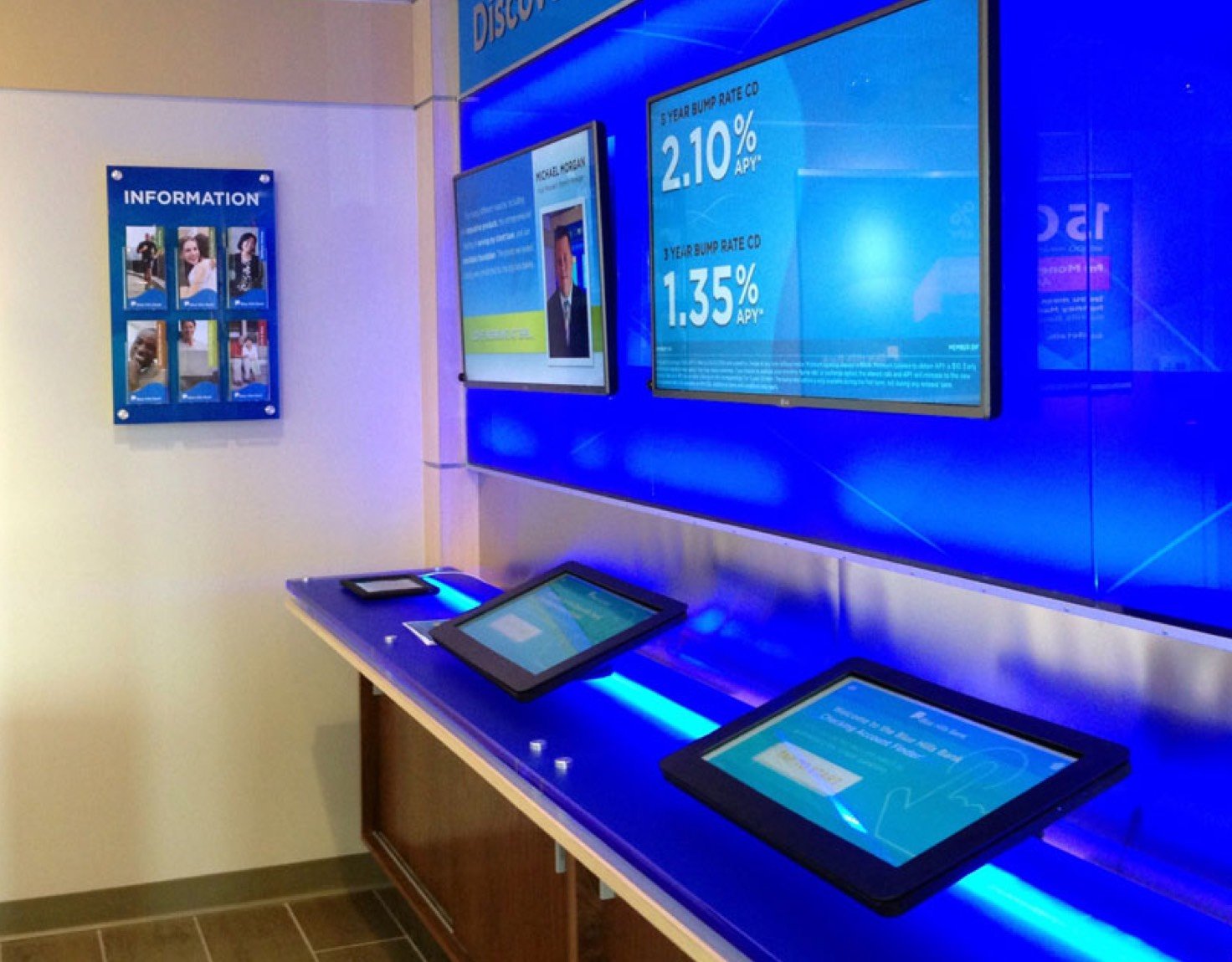
We introduced the Discovery Center, a technology bar within the branch that incorporates our traditional digital signage with interactive learning tools. Our graphic design team developed digital content from existing BHB campaigns along with a series of custom branded content. We also designed and developed the Blue Hills Bank Account Finder, an interactive tool that helps clients choose the banking products best-suited to them.
CLIENT

  • Blue Hills Bank

financial institution type

  • Bank

Features

DELIVERABLES

the challenge

space optimization for the win

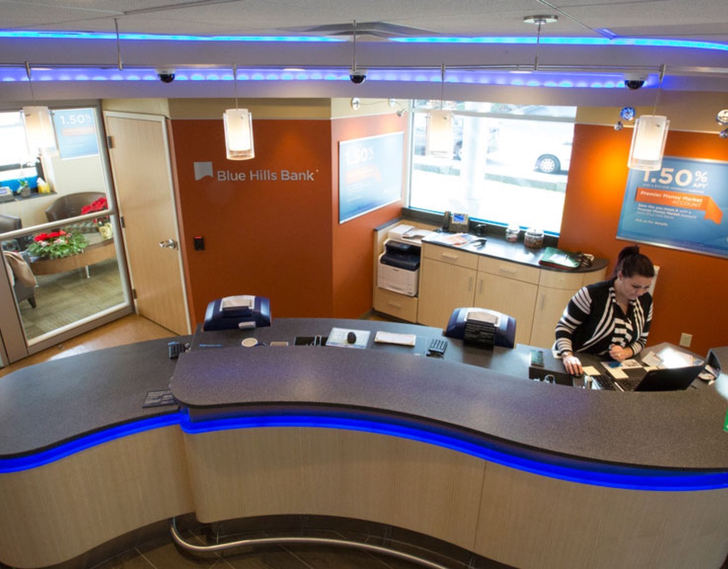
With a footprint of only 1,500 square feet, space was a main concern when designing the Milton branch. Brian Judd, Senior Designer, used rounded shapes and flowing lines to increase the visual space. The serpentine teller bar opens up the entrance and invites visitors into the branch, while assisting in directional flow. Curving, illuminated ceiling panels echo the shape of the teller bar and create a cohesive environment. The offices have glass walls and sliding doors, increasing openness and illumination while maintaining privacy.

BlueHills_Milton_Challenge
BlueHills_Milton_EveryBit

every bit matters

new features shine on

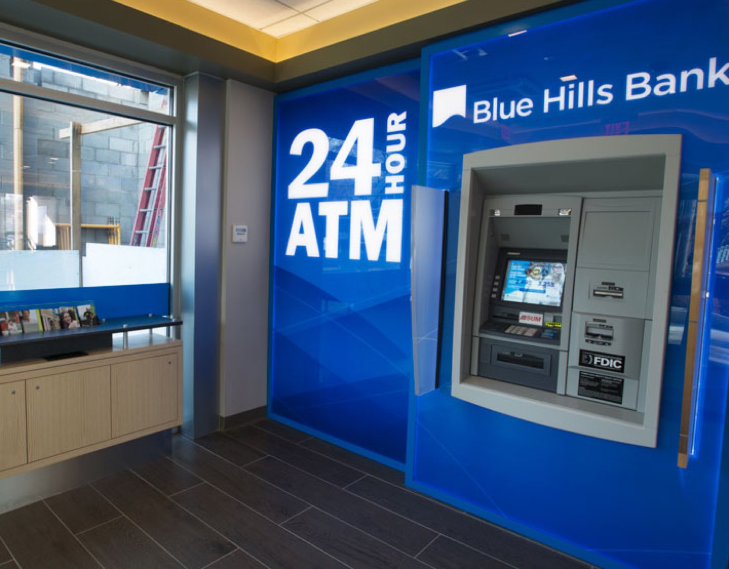
Reflective aluminum bases on the millwork make the fixtures appear to float, supporting the contemporary, tech-savvy atmosphere. We avoided creating an overly-sterile environment by using contrasting materials like wood and aluminum. Element’s design team incorporated this same look and feel into the branch’s environmental graphics. Back-screened acrylic panels and an illuminated ATM surround add to the contemporary feel of the branch. Raised metallic letters offer detail and depth, reflecting the aluminum accents of the space. Integrating technology was another key aspect of this project.

Shapes

Ready to get started?

Let's explore new possibilities for your financial institution.