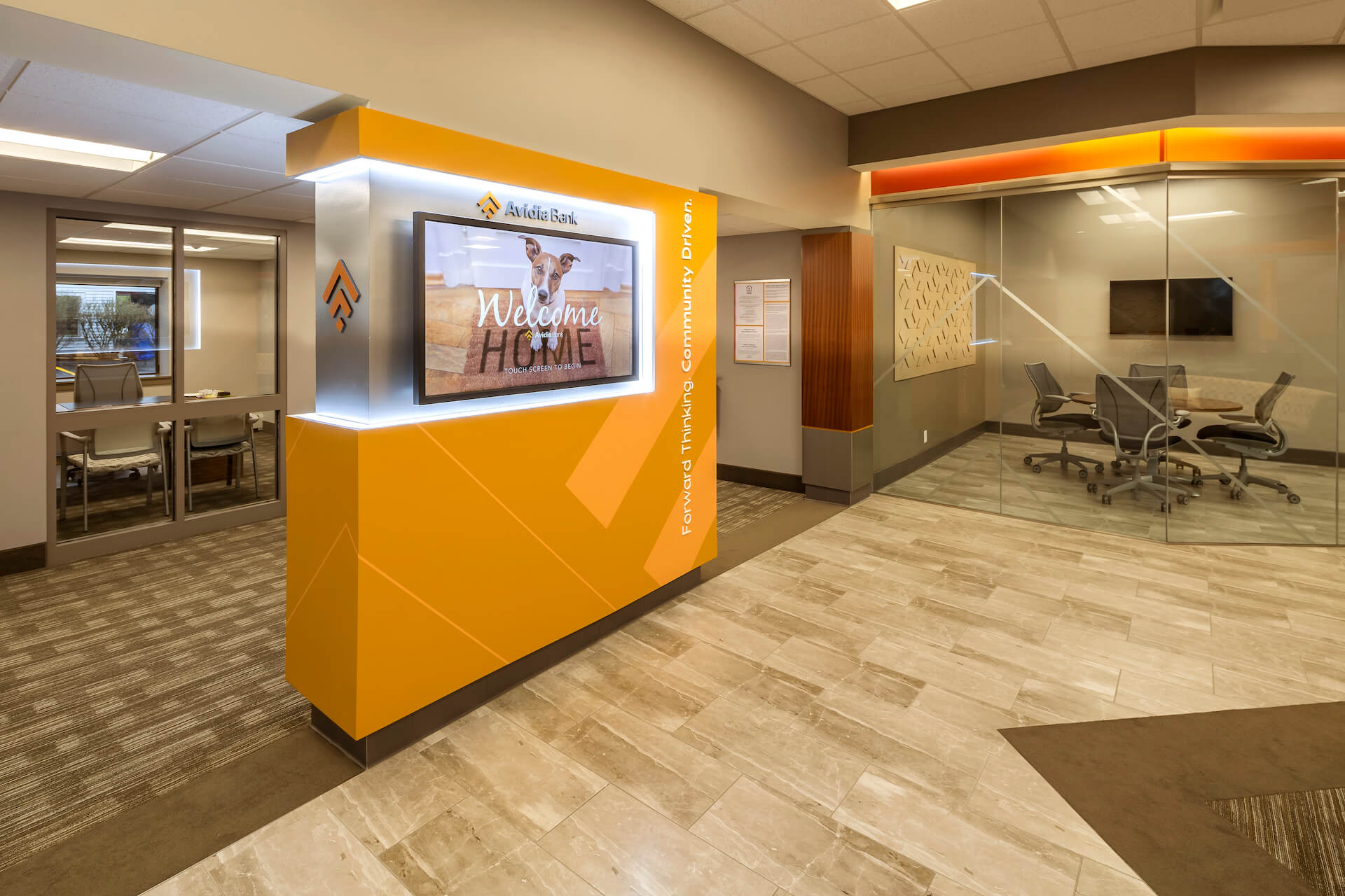
Imagine your local bank branch. Many people’s minds go to a rectangular island littered with paper forms and slips, a chest-high countertop separating customers from tellers, and a vault or locker room tucked out of sight in the back.
With the evolution of banks and credit unions, that imagery is on its way to being as outdated as velvet stanchions in the lobby. Digitization is the way of the 21st century, and that includes financial institutions. The overt popularity of mobile banking is largely responsible for this transition — with 24/7 access and resources at everyone’s fingertips, customers have been given a taste of a more measured, personalized approach to their financial dealings.
Despite shifting preferences when it comes to face-to-face interaction, the retail branch as we know it is far from dead. Branch layout design is evolving toward a more casual look and feel, giving customers a sense of belonging. Read on for answers to key questions about this evolution.
- What’s Driving the New Credit Union & Bank Layouts?
- What Are We Seeing in Interior Bank Layout Design?
- How to Prepare for Your Future Layout
what’s driving the new credit union & bank layouts?
Bank customers and credit union members tend to feel a certain sense of intimidation in traditional-style financial institutions. That sense of powerlessness surrounding something as important as one’s own finances is not ideal.
Providing open communication and easy, transparent access to products and services sets customers at ease. One way to make customers feel more secure during in-person banking is by ensuring easy connections with personal advisors.
To retain customers and members — and gain new ones — financial institutions must make people feel relaxed and unrushed, while still being able to offer fast-paced transactions when so desired.
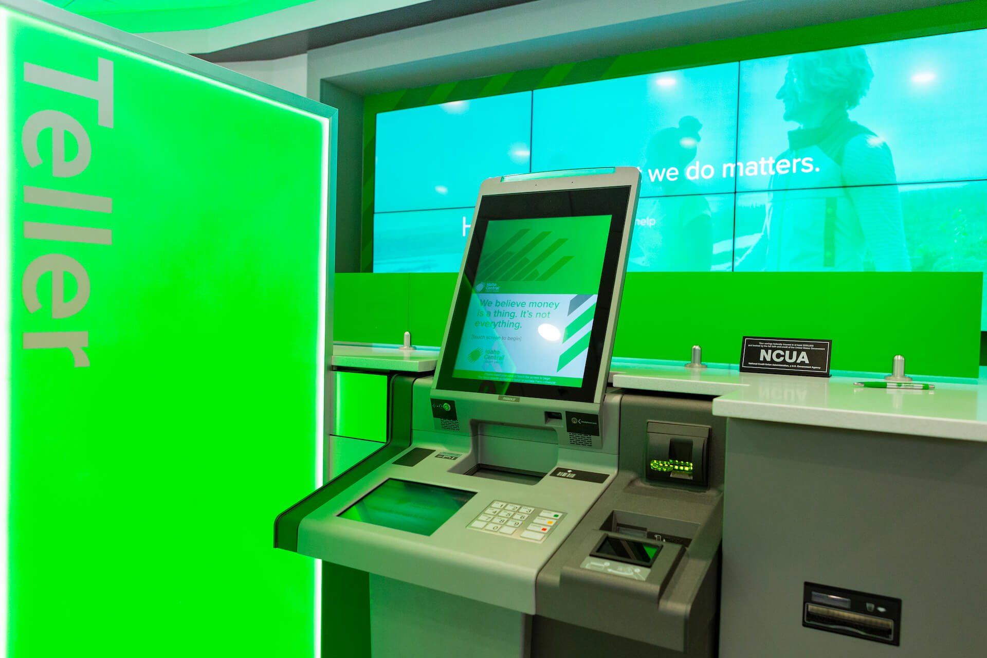
Branches must learn to create spaces that cater to the ways customers think and behave in the digital age, tailoring their visits around services rather than transactions. Aligning with the mobile banking experience should be a top priority. Tools like video banking — the use of videoconferencing technology — can be extremely useful. That experience can happen with an interactive teller machine (ITM) or in a video-enabled kiosk, for example. Focus on ways a physical branch can offer value in ways that a mobile app cannot.
More than ever, health and safety are a high priority for members and employees. Social distancing persists in the wake of the COVID-19 pandemic, and utilizing technology can help maintain connection regardless of physical distance.
what are we seeing in interior bank layout design?
Branches are downsizing, which is not a bad thing. But it does create a need to get creative with space. Utilize technology (like digital brochure interfaces) in your lobby to optimize services in less space. During renovations, reallocate misused space for a financial lounge or co-work area. Consider designating an area for after-hours services, like financial courses or guest speakers.
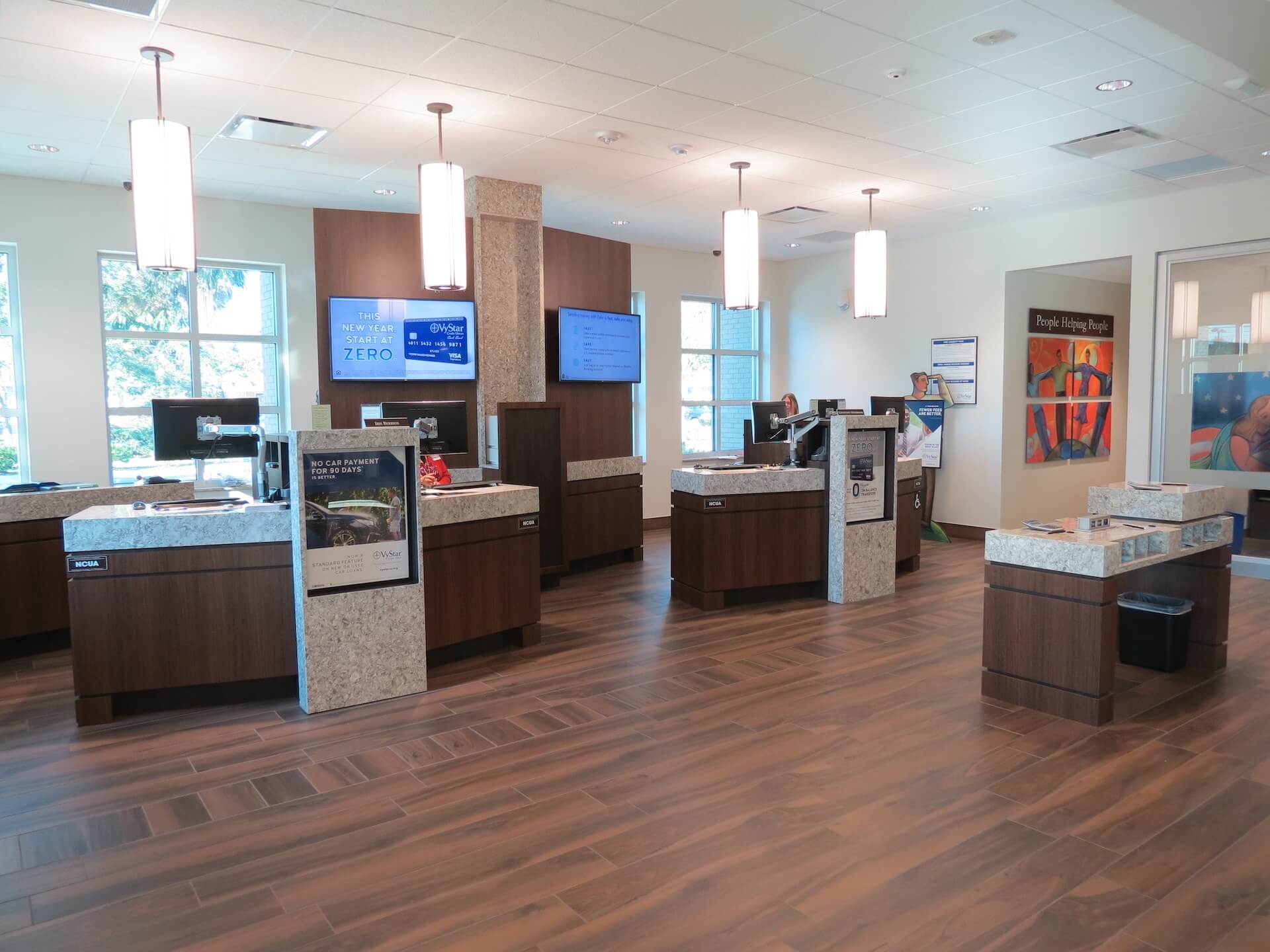
Teller “pods” have started to replace linear teller stalls. The concept creates a zone for conversation rather than just brief transactions that traditionally happen over a counter. A popular modern branch design trend is a “hub” and “spoke” model, with central seating and a counter area surrounded by the smaller pods for comfortable consults.
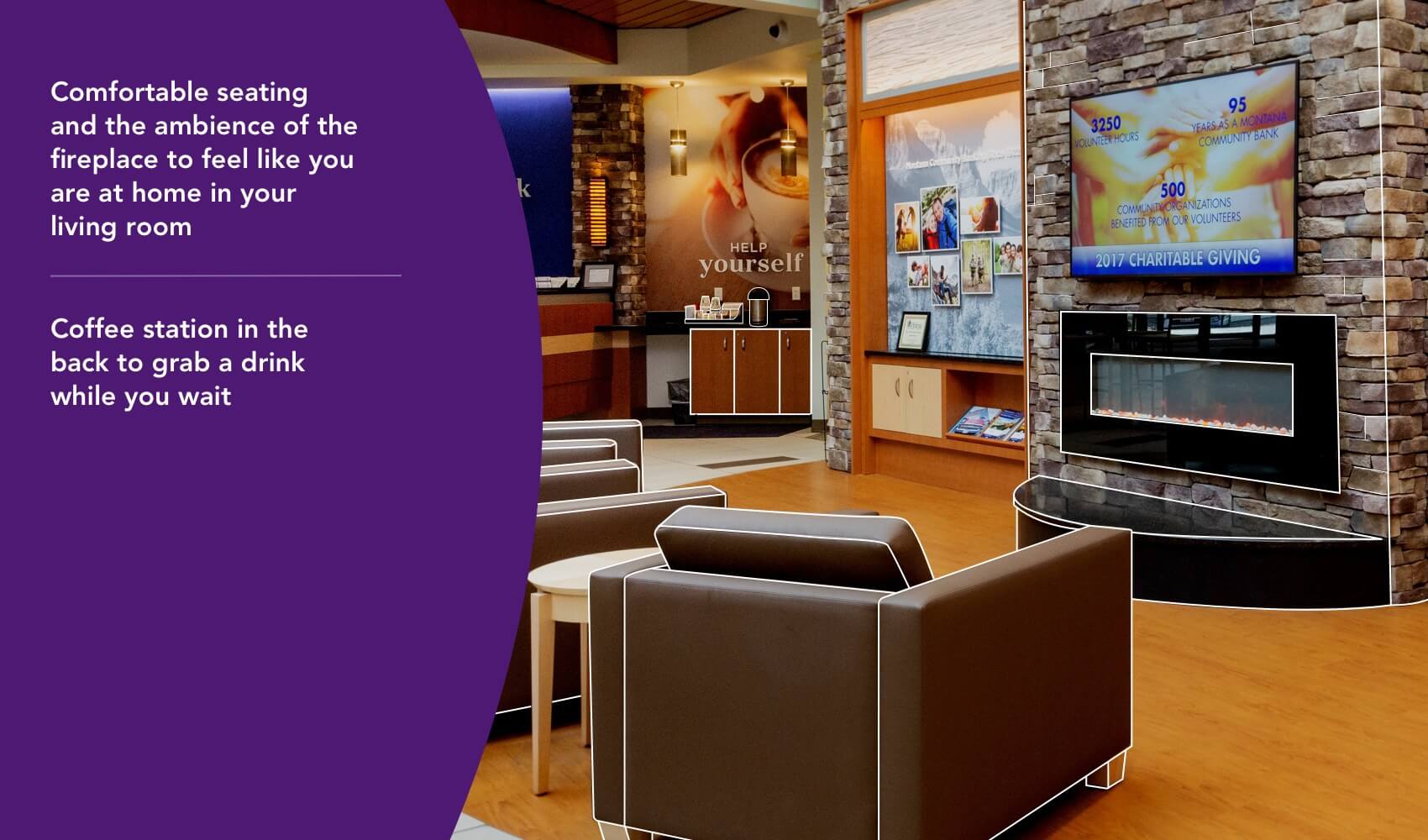
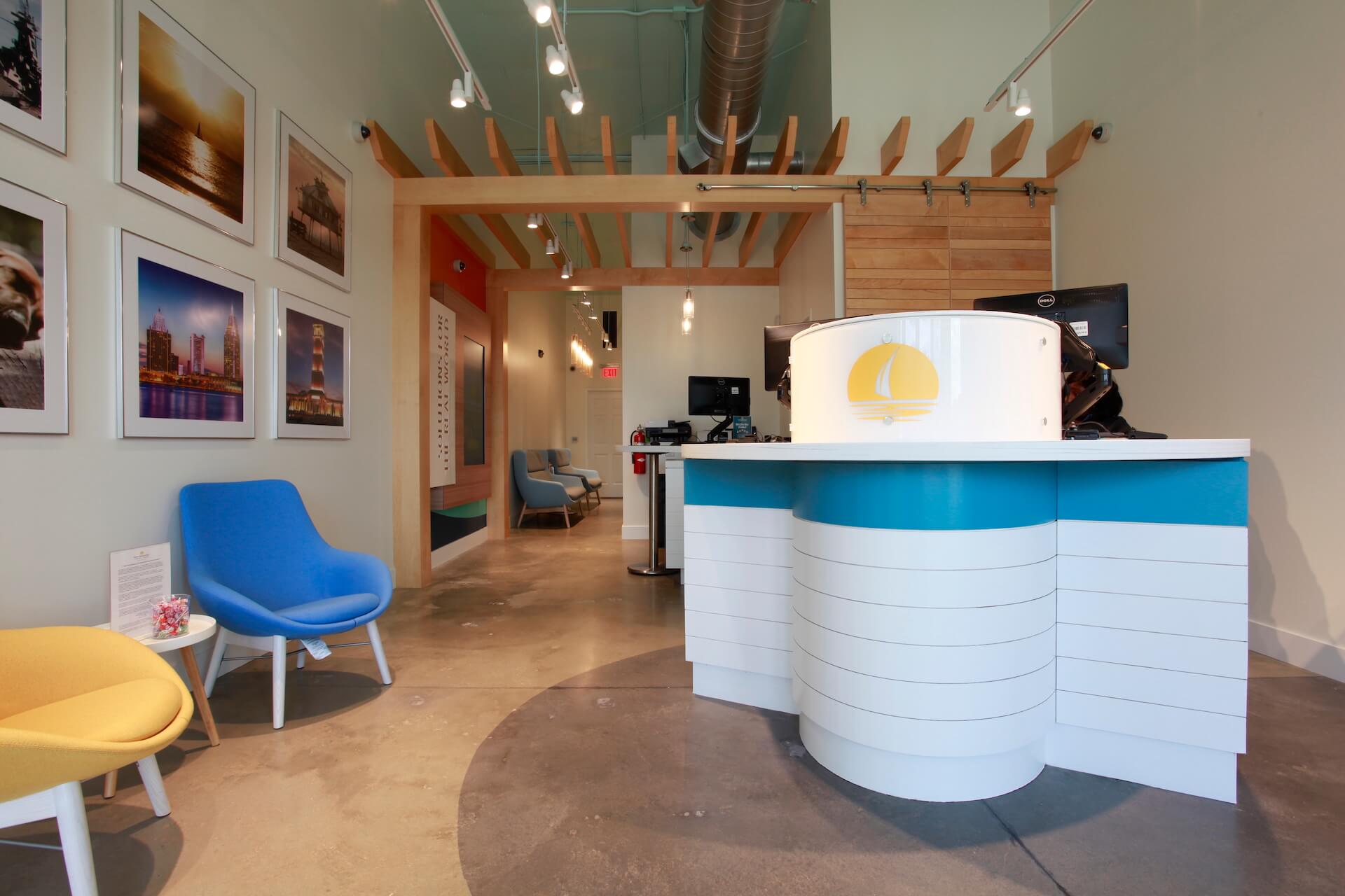
Many financial institutions are minimizing transaction stations at their branches, instead turning towards a casual café setting with lounges and seating areas.
Implementing “hubs” that offer case-specific financial services — mortgages, home loans, travel, financial needs for all ages — allows the customer or member to be the focus without distractions of a lobby or the pressure of a line forming behind them.
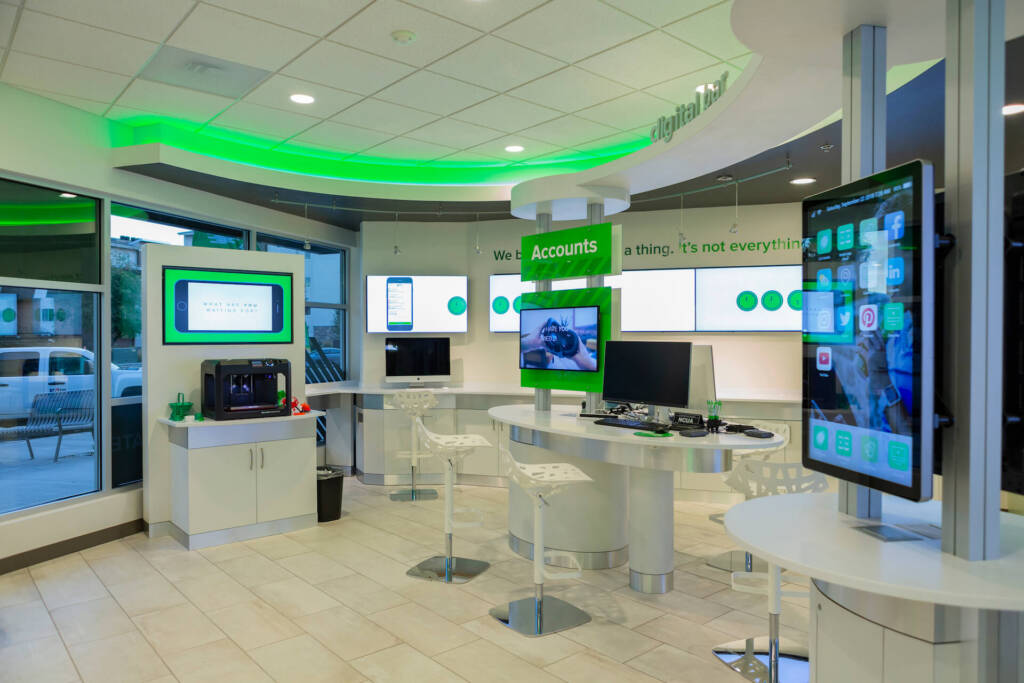
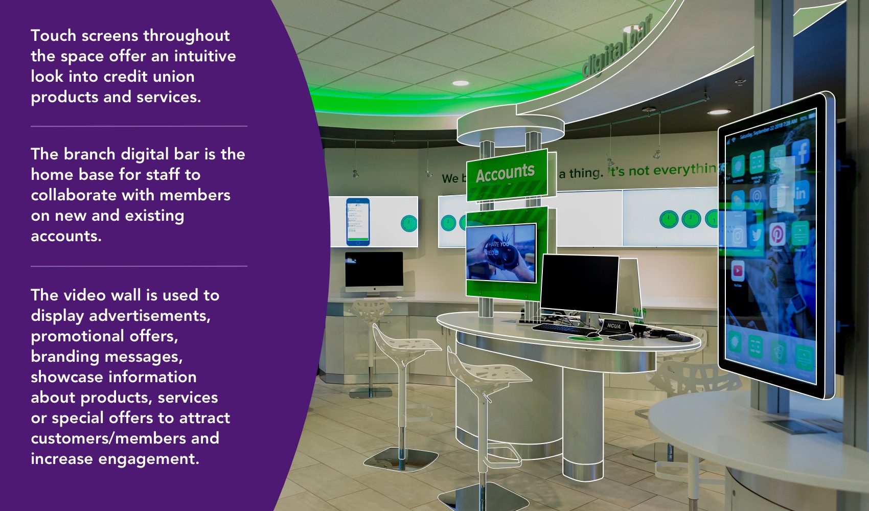
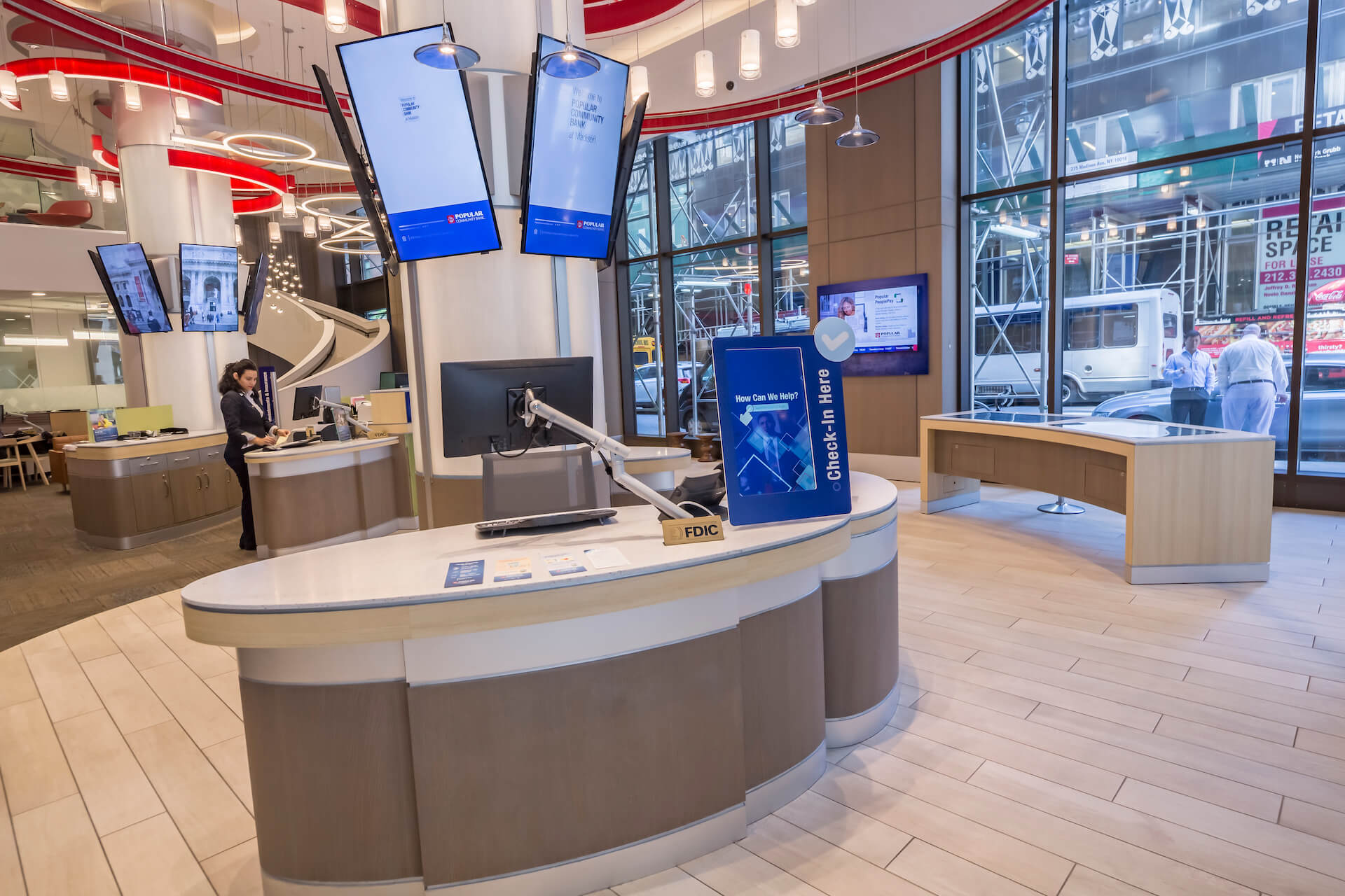
Digital transformations are largely underway at financial institutions, with touchscreens, augmented reality, and video walls becoming standard. Those options can help support the desire for enhanced self-service while freeing up your staff for banking needs that require professional assistance.
Take digital signage outside to maximize exterior projections, letting existing and potentially new members know what you have to offer. Kiosks with 24/7 access or drive-thru services can be a draw for passersby.
New in-branch offerings include virtual reality for retirement planning, video tellers, and robots to help customers and members use technology tools. Some financial institutions utilize technology to go beyond banking, offering gaming sessions, live shows, concerts, movie screenings, video art shows, presentations, and more.
how to prepare for your future layout
The process will look different for every institution, but these guidelines will help you begin preparations for an ideal layout:
- Start researching to find out what customers and members want before you begin redesigning your branch.
- Adopt an attitude and culture of openness by moving banking activities away from traditional, closed-off cubicles. By removing barriers — both literal and figurative — your customers will feel more valued. Fostering meaningful conversation and understanding customer needs allows for the creation of courses and offerings that will be well received.
- Simplify banking tasks and the concept of finances, rather than making them more complicated with unnecessary technology. Consider open concept plans that make personnel easily accessible. Layouts should eliminate physical barriers and encourage advice-based conversations. Floor-to-ceiling windows are a good way to convey a sense of transparency.
- Encourage lasting partnerships rather than brief transactions. Providing a space for a comfortable exchange of thoughts, ideas, and questions helps to establish yourself as a valuable resource.
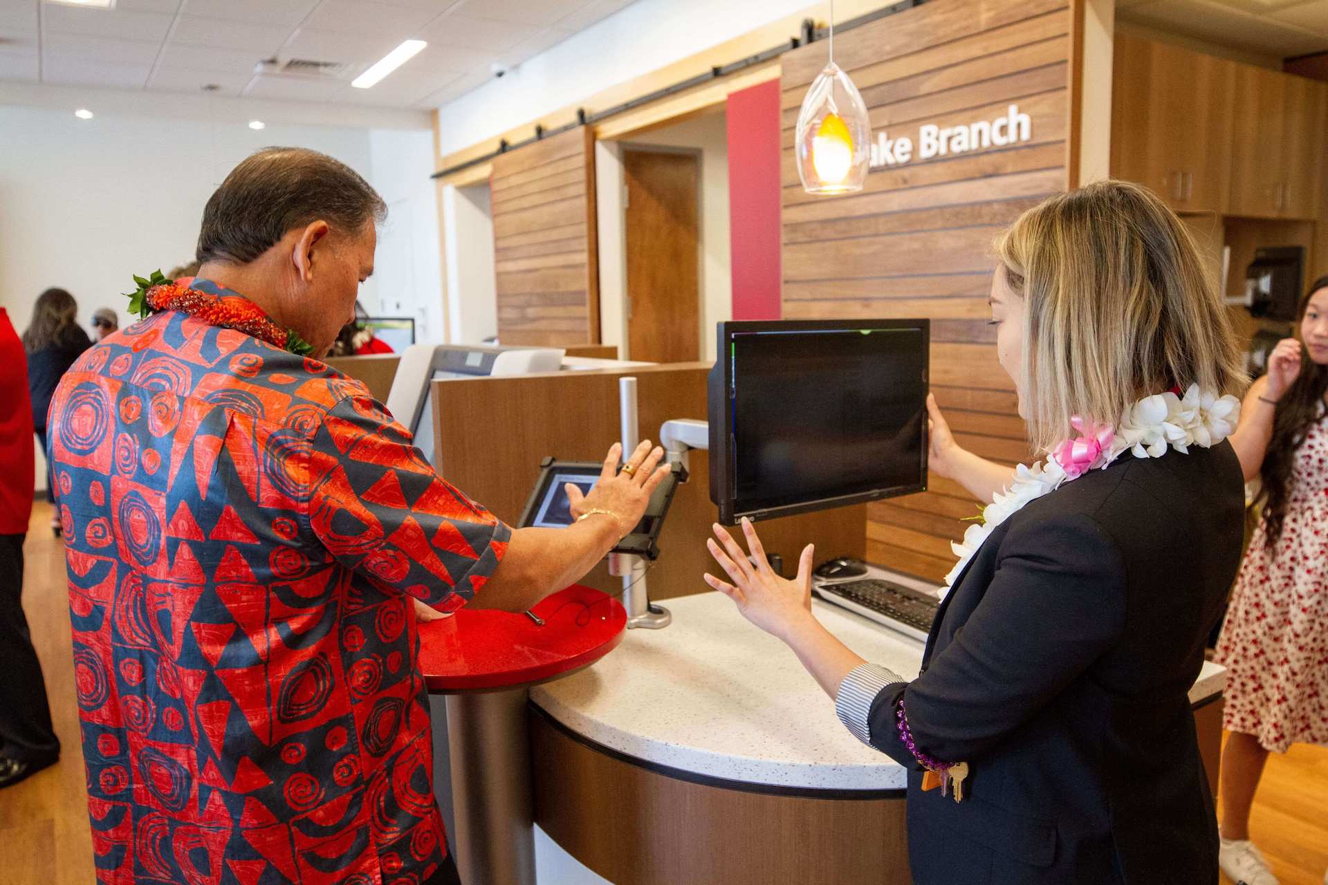
- Use technology to enhance, not replace services. Upgrade your in-branch signage to educate everyone who walks in the door about what you have to offer. Clearly mark self-service options for convenience and adopt omnichannel connectivity to switch between real-time and digital interfaces. Keep your staff on the move by providing tablets. This way, clients can be greeted by an employee and brought to a meeting pod to dive into specifics. Tablets can also be helpful for customers to check in or start a process independently on a secure network.
- Consider eco-friendly design by locally sourcing materials and labor. Explore solar panels or other alternatives to power your branch. Learn more about those options and get involved by partnering with green community initiatives. Installing community gardens and showcasing kids’ club environmental projects are just a couple ways to show customers that you care about more than brief transactions.
- Educate customers and members about what your branch has to offer. Customer experience is key, regardless of the product or service that brought them in. Not every experience needs to be memorable, but customers should walk away with a sense of a user-friendly experience. Positive associations are what make people return to your branch, instead of limiting banking online.
Want to see some final reveals? Explore our 2022 Look Book here.
