looking ahead
As Quarter 4 approaches, corporate discussion turns to the topic of budget spending and what to do with funds left at end of the year; especially those that don’t roll over. Using these can prove to be frustrating, especially if the number of dollars available falls into the awkward category of not big enough to implement big change, yet not small enough to hand out or use on spare office supplies. Additionally, spending those funds should involve some sort of strategy as the final implementation could result in long term benefits or frustrating consequences.
How to spend your end of year budget: 5 quick questions
- What is your organization’s strategy for the upcoming year? Will you need any additional resources, tools, or technology to achieve those goals?
- Are there opportunities to streamline operations, automate processes, or outsource services?
- Would you benefit from external, professional expertise to achieve those goals that seem unattainable with the current setup?
- What resources would be beneficial for your team to help them perform their tasks more efficiently? Could any of your current tools use an upgrade?
- Will your company grow exponentially in the next year, thus engaging with more third-party vendors?
If you answered “yes” to any of the above questions, a great solution is the “light renovation.” Putting end of year budget dollars towards smaller scale renovations is a great and easy way of updating the retail environment and has proven to be a great return on investment in terms of pulling foot traffic and customer engagement.
what does this mean?
Typically, when we hear the word “renovation,” we think large-scale transformation or brand update. Contrary to popular perception, a renovation doesn’t have to be large.
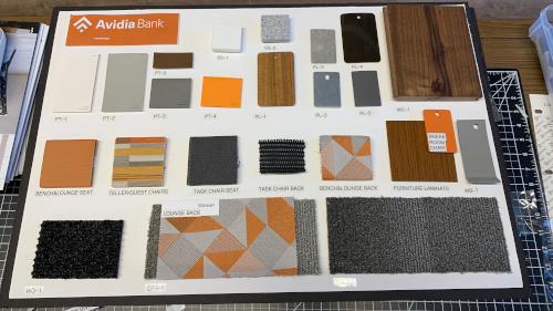
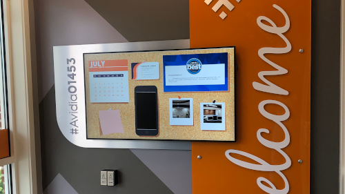
In fact, here at The Element Group, renovation doesn’t equal transformation. A branch transformation is a complete update geared towards realizing the retail branch experience through the combination of interior design, technology, and human capital. On the other hand, a renovation can be as simple as making slight changes to design elements in the space’s interior. This is as simple as updating wall graphics, adding a new digital display with unique content such as interactive and touch experiences, new furniture, add or update digital surrounds, choose new carpeting, updating the lighting elements, and more.
Ultimately, small changes like these are low cost, low commitment, and low disruption, with the goal of making a space more cohesive or creating a fresh new look.
These small-scale updates can positively impact your brand in the long run by creating visual clarity, increasing brand translation, and drawing people into a brick-and-mortar space. It’s a bonus if a renovation is already in the works for the next year. This is a great way begin building that relationship with your Design/Build firm; it provides an opportunity to get a jump start on any future design work by communicating the brand standards.
Not only are you kickstarting the design process, but you are also using up those extra dollars in a cost effective, time efficient, and dynamic way.
small scale renovation in action
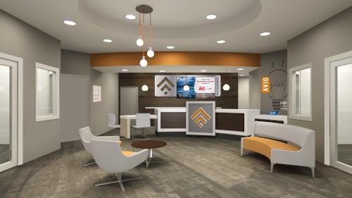
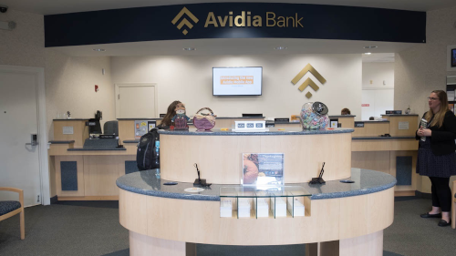
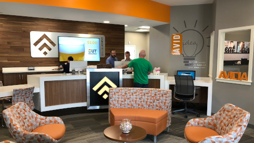
To model what this type of renovation could look like, we revisited our Avidia 8 Day Branch Renovation to show how transformative a little work can be, and how efficiently that work can be completed.
Through this light renovation Avidia was able to:
- Renovate quickly and efficiently
- Effectively translate the retail environment on a smaller scale
- Grow the market share in their community through a cutting-edge branch
- Attract a younger demographic through the use of technology and modern design
- Maintain a consistent look and feel across all of their locations
- Have a lasting impact on new customers and reengage existing ones
goals
Avidia Bank’s goal was to carry the modern look and feel of their two new branches and apply it to their Leominster branch, with the overarching focus of attracting and engaging a younger demographic. Ultimately, this would target new customer segments and help Avidia to build more market share in an area already saturated with banks and credit unions.
Avidia Bank stressed the importance of being able to serve their customers in the community and decided to keep the main portion of the branch open. Due to the contained nature of the project, The Element Group was able to fast-track the process, designing an implementation plan that completed the renovation in just eight (8) days.
features
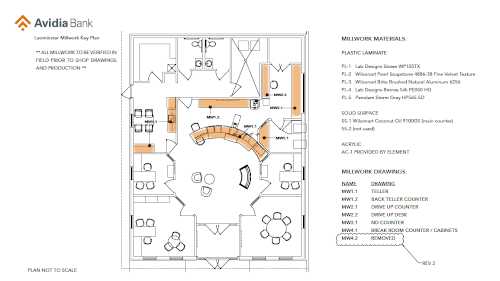
Avidia’s renovated Leominster branch features an open-concept lobby, modern furniture and lighting, and touch technology that provides customers with immediate access to up-to-date brochures, account information, mobile banking demonstrations, and much more.
The addition of teller pods with “cash recyclers” helped make transactions quicker and more efficient. Cash recyclers count the money for the teller, allowing them more time to focus on their customers.
In this case study, Avidia was able to demonstrate how strategically updating core elements brings a whole new look and feel, without completely gutting the space. An ideal medium for end of the year budget spending, a renovation like the one done at Leominster proves that a lot can be done on a short time span, with lasting effect.
Through simple changes in lighting, furniture, and technology, Avidia was able to revamp their Leominster Branch in such a way that reengaged customers and translated their brand more effectively, getting them to say “Wow! This doesn’t even look like a bank, it’s beautiful!”
